Gradient Guide
DRAFT
At its core, gradienting is a method in the building process that adds detail to otherwise bland surfaces. In the past before recent gradient methods were developed there was an over-reliance on depth and haphazard 'splatter' texturing to create interest. In recent years however, an increasingly greater emphasis is placed on reducing depth and excessive structural detail in favour of realistically rendered gradients. The purpose of this guide is to inform the reader on how this technique is achieved.
Preliminaries:
- All in-game images used in this guide are located on the ArdaCraft server and are accessible via /warp GradientGuide. It is recommended to view these for yourself as it helps visualize the techniques explored in this guide in a more engaging way. The in-game guide follows this entry chronologically.
- If you wish to skip directly to the meat and potatoes, then start at Techniques - however beginners are advised to read the entire guide for a better understanding.
- The later sections of the guide from Applications onward focuses on practical examples and ideas. Experienced builders will find these sections especially relevant.
Overview
Gradients, blending, texturing or transitioning all refer to the same basic concept. It is a process in which one value (or tone) is transitioned to another from A -> B -> C. In drawing, this can be thought of as shading, in painting as blending, or in pixel art as dithering. No matter the medium, the goal is always to tidily transition between light and dark details to create a harmonious effect. In Minecraft we refer to this as gradienting, and it is achieved by mixing a number of blocks in a sequential order to create a seamless and tidy blend.
While the concept of blending blocks together seems simple enough, in practice it can be difficult to master. This is because factors such as block type (stones, woods, plasters etc.), colour, and CTMs affect the transition quality of a gradient. The most common way in which beginners mess up a gradient is by missing a step in the transition that could blend the blocks more thoroughly. Nothing ruins the illusion of a realistic surface quicker than noticeable blocky squares due to a poorly blended palette.
Weathering
....
Any structure that is left unattended to the elements will over time weather and deteriorate. There are varying kinds of weathering that break down structures, notably physical, chemical and biological weathering. These all have unique effects, and it helps to have a general idea of how they work.
The most common type is physical weathering where mechanical forces promote the decay of a material. Fluctuations in temperature can cause an unequal expansion and contraction, leading to cracking and warping. Likewise,
Weathering patterns
Design principles
Patterns
An appealing pattern serves as the foundation of any good gradient. This 'pattern' refers to the effect that some kind of weathering has on a surface, such as the drip of water, darkening of corners or patches on a wall. There are different patterns that will work in different contexts, and at times it may help to use more than one.
Typically, the most common pattern is a kind of cluster that will vary randomly in a blob-like shape across a larger surface. These clusters usually represent where there is damage or decay on a surface, but also serve as the main interest-driver in your gradient. It involves a combination of realism (which parts of your surface are weathered) and design decisions.
Palettes
a
e
Process
Before creating a gradient, it's often a good idea to begin with a blank template - wool/canvas blocks are a good option. The reasoning behind this is that it's much simpler to focus on one element of your build at a time. Moreover, gradienting can be an arduous process and it's helpful to settle on your general shape before committing your time in finalising the texture. Remember that the gradient is just the final step in the building process, and a great gradient can't save a wonky and half-baked structure!
Basic canvas shape
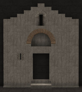
So to begin, we have a simple canvas template of the building (a Byzantine church in this case), with the main architectural details added. This is effectively where the most thought and work is put in; proportions, door and window designs, etc are figured out here.
It's important to think about your steps down the line when it comes to adding a gradient. An over-detailed surface with too much depth and detailing will be very difficult to adequately gradient. Depending on how much detail you choose to add to your template will dictate how detailed your gradient will be. A highly detailed canvas template will call for a simpler gradient, and likewise a simple surface can be elevated by a more intricate detail. Or not! Surroundings matter, and it's valuable to be aware of what's around your building to accommodate a cohesive level of detail that balances out your overall area. If house B that you have already completed is quite complex, perhaps house A next to it can benefit from less detail and give some room to breathe. Cohesion is more important than pretty but disjointed individual components.
Canvas detailing
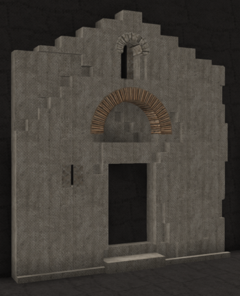
Once the basic canvas shape is in, then it's time to start thinking about weathering. Textures consisting of stone, wood, plaster etc. can often benefit from cracks to help show age. Cracks and shipped material works well in the corners of the building, in areas around wall openings such as windows and doors, and in areas that connect different wall angles (the corner of two buildings for example). The placement of these cracks shouldn't be random but intentional where it makes sense for them to appear. It's easy to overdo this and create a highly damaged building, so add it tastefully to enhance the shape of the building. Bear in mind while doing this that the cracked areas will be your most damaged - this means these are often the darkest stained parts of your building! Some forethought of your gradient design in this state will help a lot, but this comes with experience. Sometimes it's simply a back and forth process of adding cracks and gradient stains interchangeably to get a satisfying end product.
Adding in your gradient
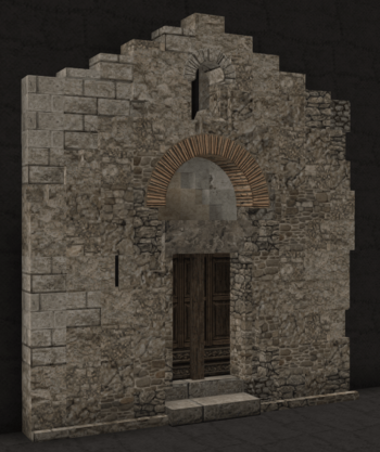
The final step is to replace your canvas template with your actual gradient. Before doing this however, it's worth setting out your palette before applying it to your building. The size of your palette will depend on the size of your structure. Too many blocks in your palette will end up in an excessively detailed gradient (even if you can transition them all smoothly), and too little will look bland. Find a balance that you feel is appropriate and then blend it into your building. Remember that your gradient should follow what you've done with the cracks, and if you need to make any adjustments then move the cracks into positions that compliment your gradient. It's also not uncommon that, upon adding a gradient, you realise the shape of your building and/or cracks are excessive and make for a messy final build, so sometimes it's also necessary to move things around to strike a good balance. You're effectively painting a canvas in this step, so it's important to spend enough time until you get a good result since this is the final polish of your build.


